RICHMOND PLUMBING
THE PROBLEM
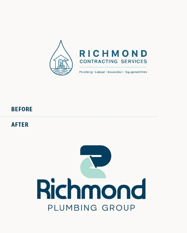
Richmond Plumbing came with a single, highly complex logo,
Traditionally trades have very descriptive logos and Richmond was no exception. The original logo was highly complex but also had no variations for different marketing application.
They were ready for a new look to help them be easily recognised and scale.
THE SOLVE
Researching the industry and re-designing their logo were key in building a brand identity that was simple, memorable and unique.
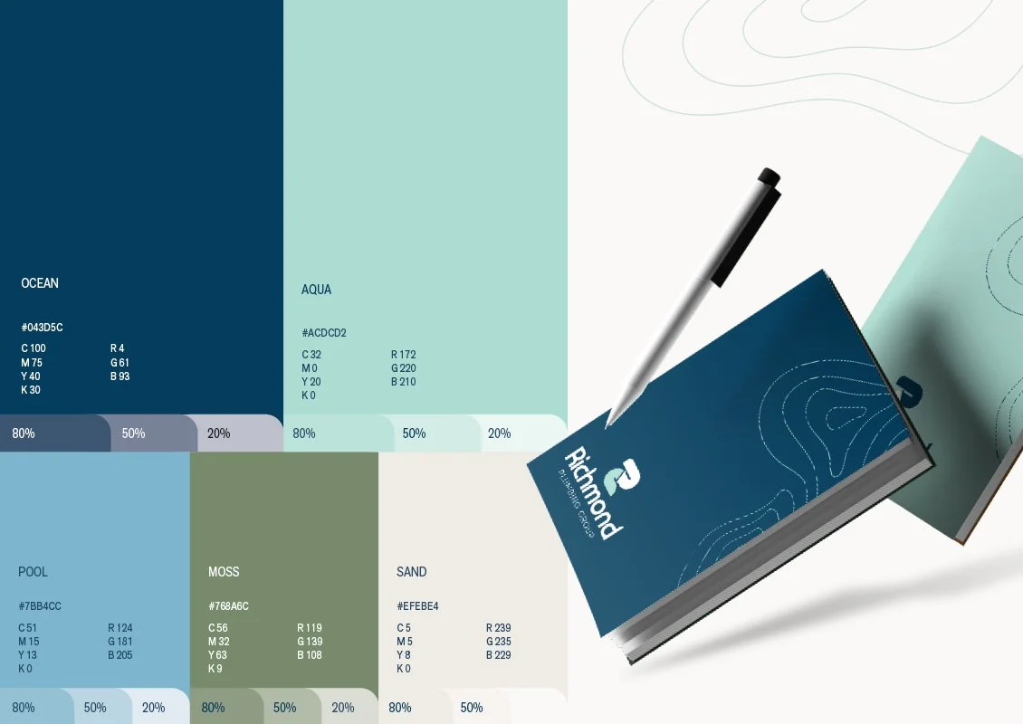
We gave them a fresh colour palette to apply to all their advertising and communications. Coupled with a strong visual brand and logo mark, it gave scaleability to allow their brand to be applied to large signage and still be legible at small scale.
The new brand has helped them scale and position themselves as the go-to in their area.